
Final Table of Contents
- Ana Botea
- Apr 6, 2021
- 2 min read
I believe that the most changes went into the table of contents. I was not sure of what looked best and more importantly what I should change, so I tried multiple details and changed some of them around in order to achieve the final pages which I thought looked best.
DRAFTS AND TRY-OUTS


FINAL RESULT
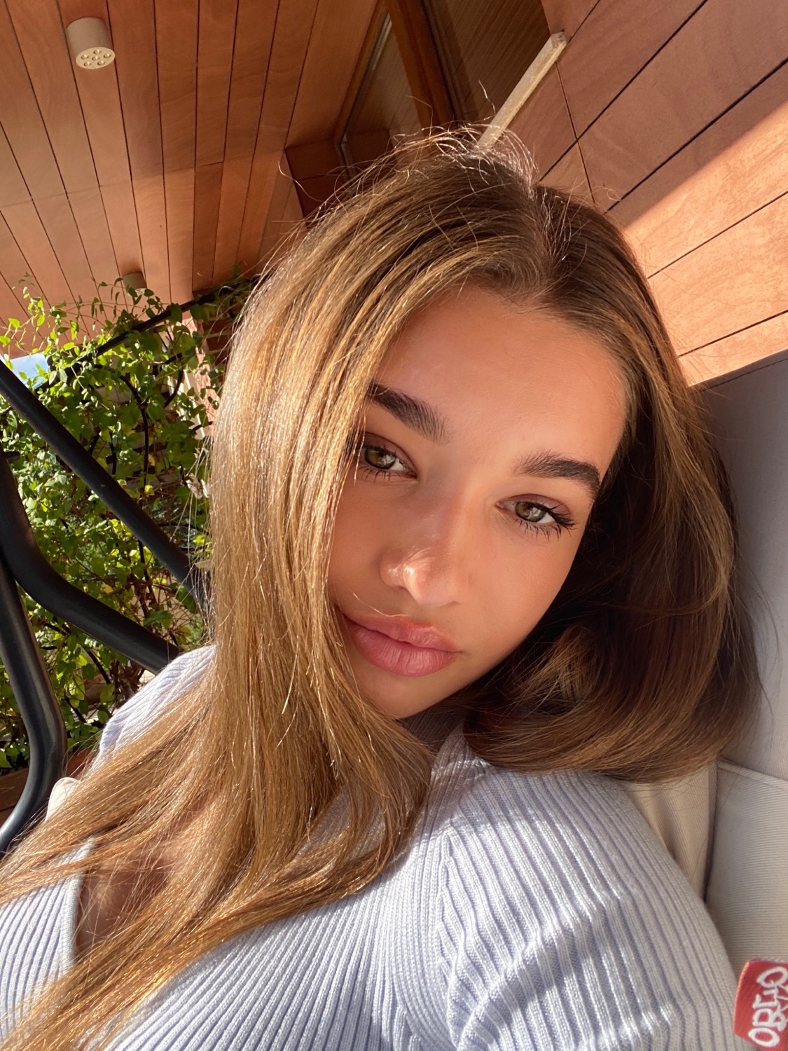
For the final result, I decided to go with a more simple look especially for the second contents page, as I felt like the more airy layout caught the eye of the reader more than the first options which can be seen above in the drafts. It is important to me that the target audience is hit by even the first pages and persuaded to read the magazine, and although the models I used are young of age, the overall photos are a combination of elegance - as can be seen in the first photo on the left page, of her holding a glass of wine and a book - and youth - as can be seen on the right page.

On my Table of Contents I decided to present the SYLK logo once more in order to give it a more professional look as well as for further advertising. Moreover, the instagram username can be seen once more on the down left corner of the second page - once again, for further publicity and in order to remind the reader to check it out as well.
I highlighted and wrote in bigger letters the titles that I thought were more important, which outlined interactive activities for our readers as well as topics relevant to the present time that we live in, while keeping everything clean. The photos that I used are also previews of the articles that I matched them with (for example: Page 36 = green or red? Therefore, the dress the model is wearing is red and can be visually associated with the article, making sense to the reader.
I also decided to use the flat plans as to cut the second picture in order to give it a more mysterious look and intrigue the reader into wanting to see the whole picture, while the top line is a reminder of the highlight on the first page, the April Contest - persuading the reader once more to check it out just like the Instagram username does.
Lastly, I chose a font which is rather simple, as after all that is the look that I was going for, and put the number of the pages in bold as to make the distinction between them and the actual title clear, with no misunderstandings.


Comments