
Final Double Spreads and back cover
- Ana Botea
- Apr 6, 2021
- 3 min read
I decided to create two double spreads in order to cover a whole article/ pictorial - and that of 'confidence', which is the first article of my magazine. Therefore, I will present the drafts and try-outs first for both the double spread and back cover, in order to show the process that went into creating the final product.
DRAFTS AND TRYOUTS


I did not take many screenshots of my work for the doublespreads and back cover, as I was sure of what I wanted from the beginning. However, in the final product you will be able to see some differences in details or photos as well as the second double spread, that I worked on and was confident with from the beginning.
FINAL RESULTS
Click on the images in order to see them full-sized.


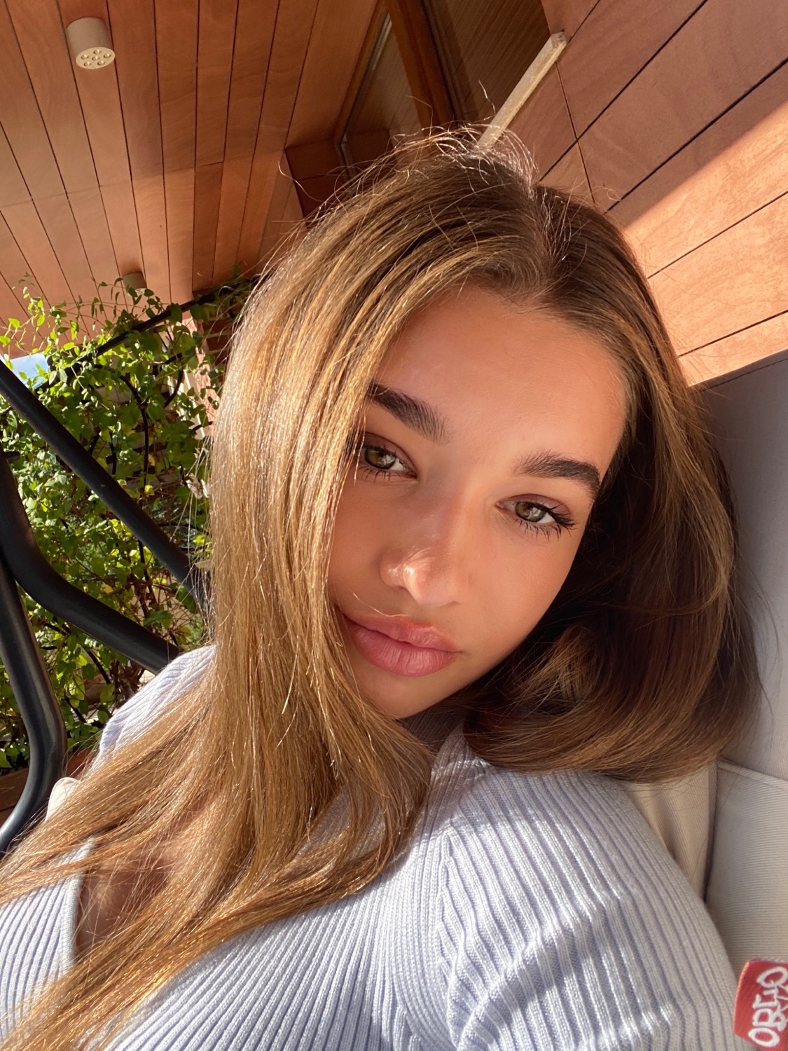
For the 3rd and 4th pages, I decided to use my creativity and ideas into building something I have probably never seen in a magazine, which is the word frame. I believe that it draws the attention of the reader and moreover gives the page a nice layout. Furthermore, I added the title of the article on the pages containing it, so the reader is more aware of the fact that they are still reading it and it will be easier for them to make the connection between the page, article and title as seen in the Table of Contents. I chose to use a variety of photos in order for the article to be more dynamic and followed conventions such as the thin texts presenting aspects such as models, photographer etc which I have seen in all of
the magazines I researched earlier this year.
Furthermore, for my second double spread I wanted to use a simple layout yet one that would have an impact on the reader. I believe that a more airy look would interest the target audience more deeply as they'd understand the page better and feel more welcome to read the article. Therefore, my first page of the second double spread presents an informative headline as well as an informative text just like the one on the 4th page in which the models are presented as well as the photograph concept.
What I like about page 6 is the simplicity of it. I like the fact that the most important aspect of it is the writing, which in my opinion further persuades the client to read it as there are no other photos to draw their attention - the impact therefore being bigger with no photos, especially since the text is not long. Moreover, the rose is meant to be a detail which inspires confidence and emphasises the idea of 'beautiful but dangerous', which is exactly what being confident means, giving the page more life as well. As Sylk Magazine is meant to be commercial but also artistic, I believe that these details are the ones which make the difference between a professional magazine and an amateur one - my goal being resembling a professional one as much as possible.
As for the back cover, I decided that it would be fit for me to create one in order to really complete the magazine as if it would be a real one. I did not add much to it, because from the research I recently made regarding back covers they should be simple, but added a code which brings people to our instagram page as well as a 'goodbye' message - to make people want to return to the magazine subconsciously.


Comments